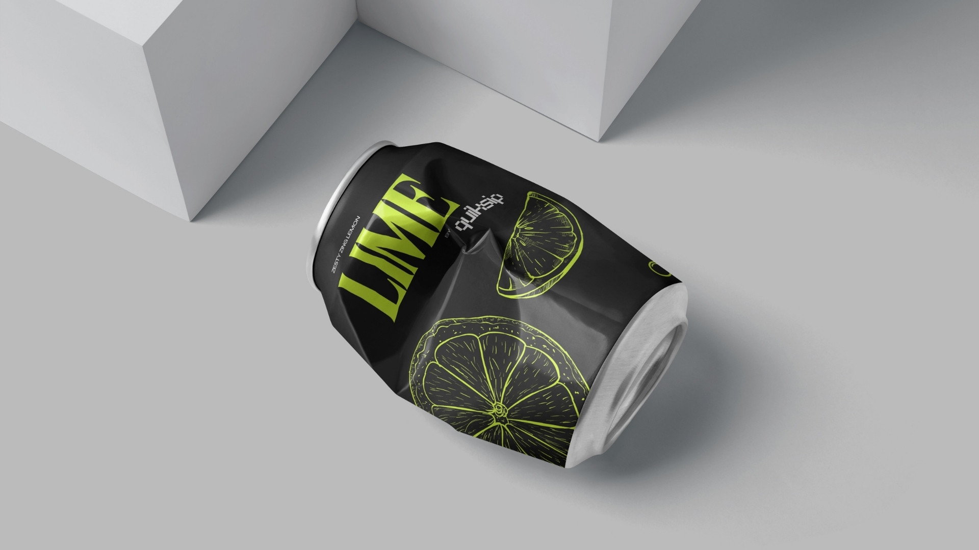
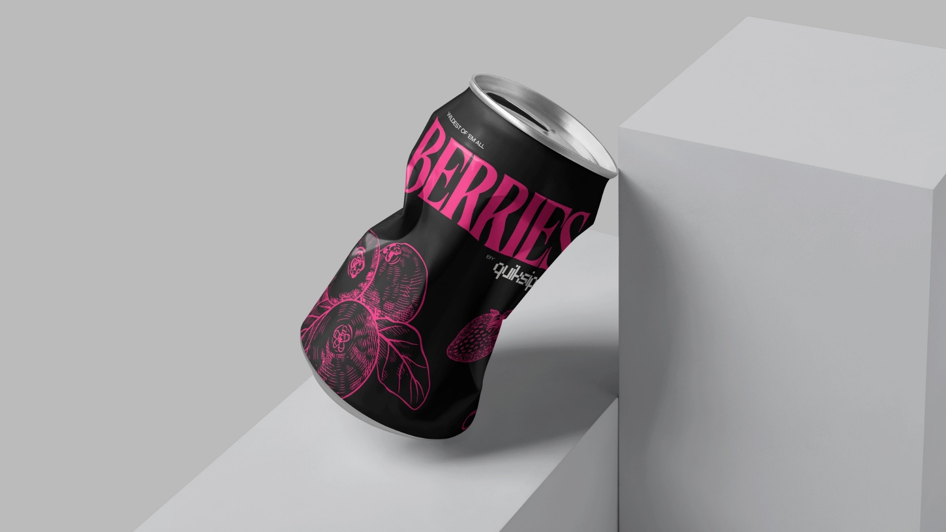
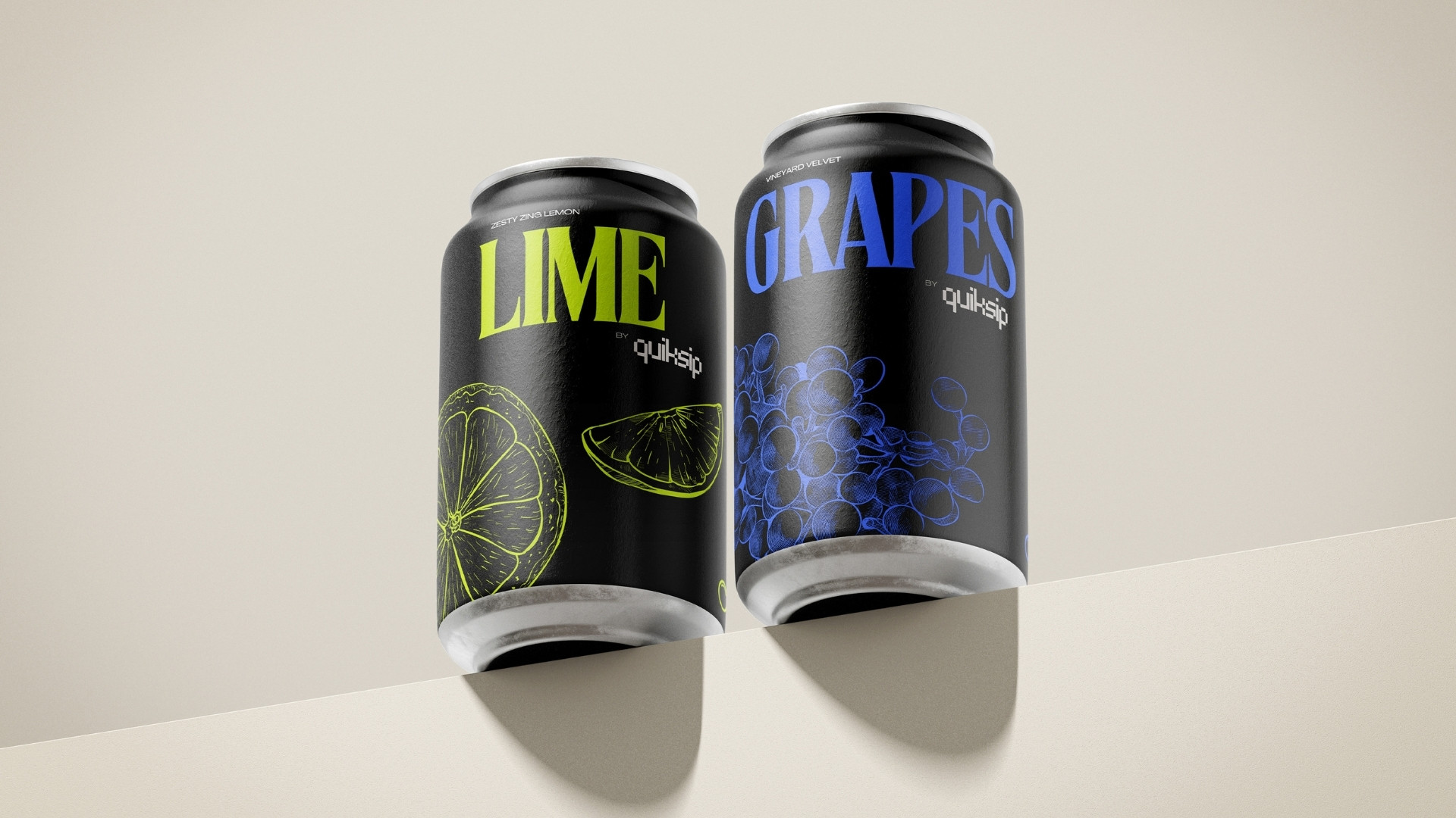
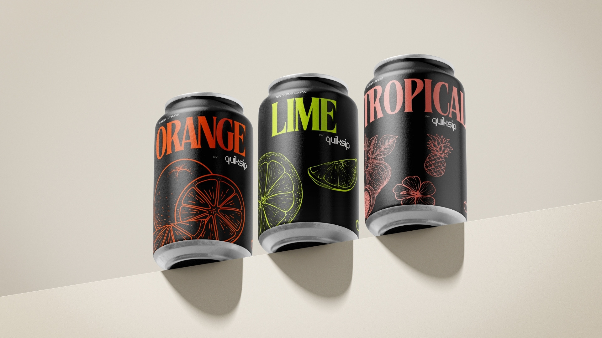
Quiksip is a bold and dynamic energy drink brand concept designed to break the visual monotony of the beverage aisle. More than just an exercise in creativity, Quiksip was a statement about how design can energize a brand from the very first glance. From the name and visual identity to the packaging design, every detail was intentionally crafted to deliver impact, clarity, and shelf appeal.
The result? Quiksip won the Iron A’ Design Award in 2024—one of the most respected global design accolades—recognizing it as a standout in the Packaging Design category.
A’ Design Award & Competition
Award Winner
The Concept
The name Quiksip communicates instant energy and ease of consumption—a "quick sip" of power. The brand embodies sleekness, forward motion, and modern lifestyle appeal. The idea was to position Quiksip not just as a beverage, but as a design-forward product that stands out with subtle confidence.
What Made It Special
This project was personal. It wasn't created for a client—it was born from a desire to express the power of independent design thinking, without constraints. Quiksip showcases how much impact a single designer can make with clarity of vision, attention to detail, and a strong storytelling angle.