Details
Clients
Location
Involvement

Dripd Paints, Color Innovation from Finland

The Quiksip project began as a canvas of endless possibilities, aiming to encapsulate the vibrant essence of the brand’s flavors in its visual identity. The design process was meticulous, starting with a deep dive into the brand’s core values and the tastes they wanted to represent. Sketching and digital illustration merged, creating bespoke imagery for each flavor that would resonate with the target audience.

Dripd’s color range is inspired by the natural landscapes of Finland, from the deep blues of its lakes to the lush greens of its forests. The design of each bottle is a reflection of this inspiration, with the use of clean, bold shapes that mimic the serene simplicity of the Nordic outdoors.

Functionality is at the core of the Dripd brand, with bottle designs engineered for ease of use and precision in application. The choice of a matte finish on the bottles speaks to the quality of the paint within, which promises even coverage and lasting vibrancy.

The aesthetic of Dripd bottles is deliberately modern and understated, allowing the colors themselves to be the heroes. The uniformity in bottle shape across the range offers a cohesive look, while the caps provide a pop of color indicative of the paint inside, making selection intuitive and visually engaging.

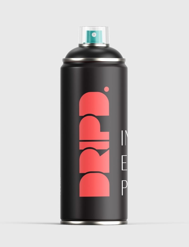
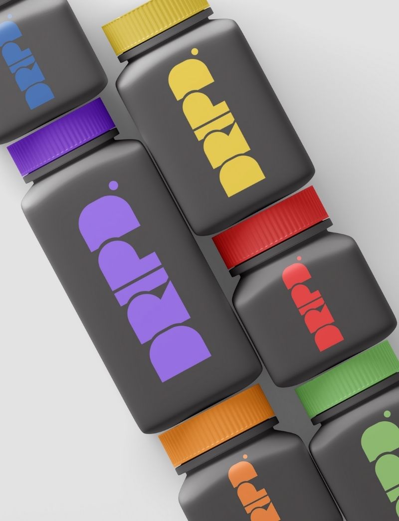
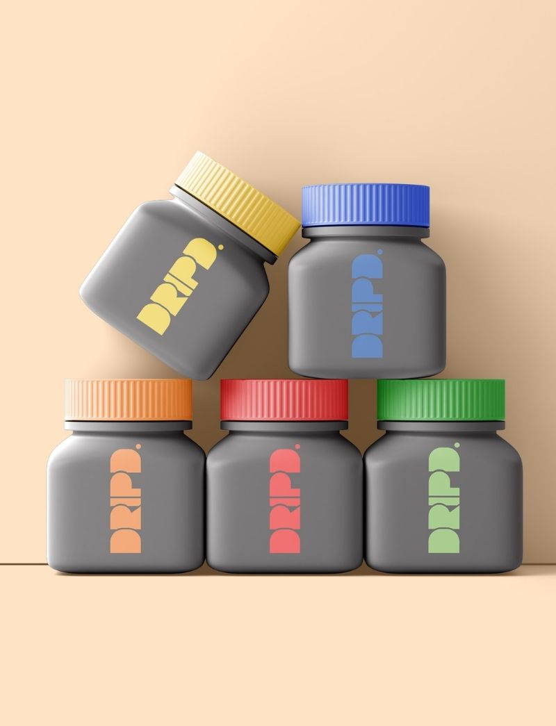
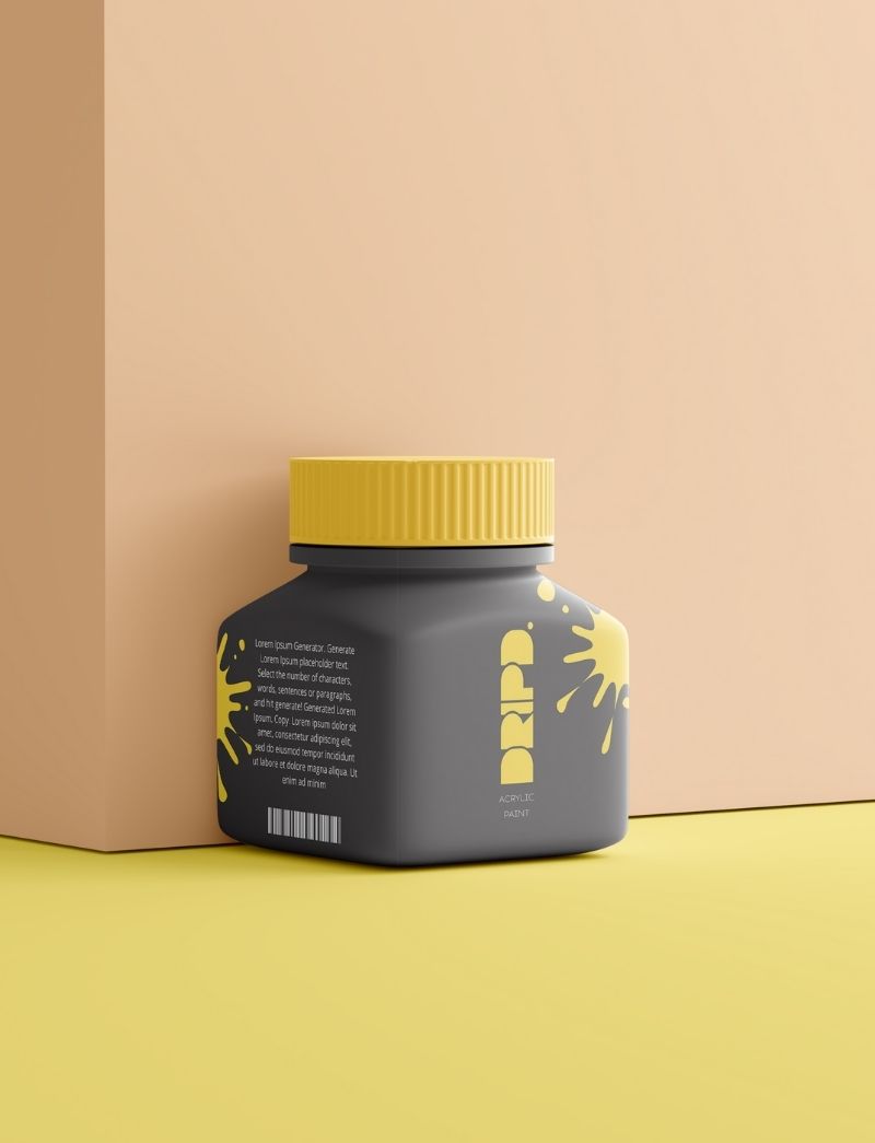
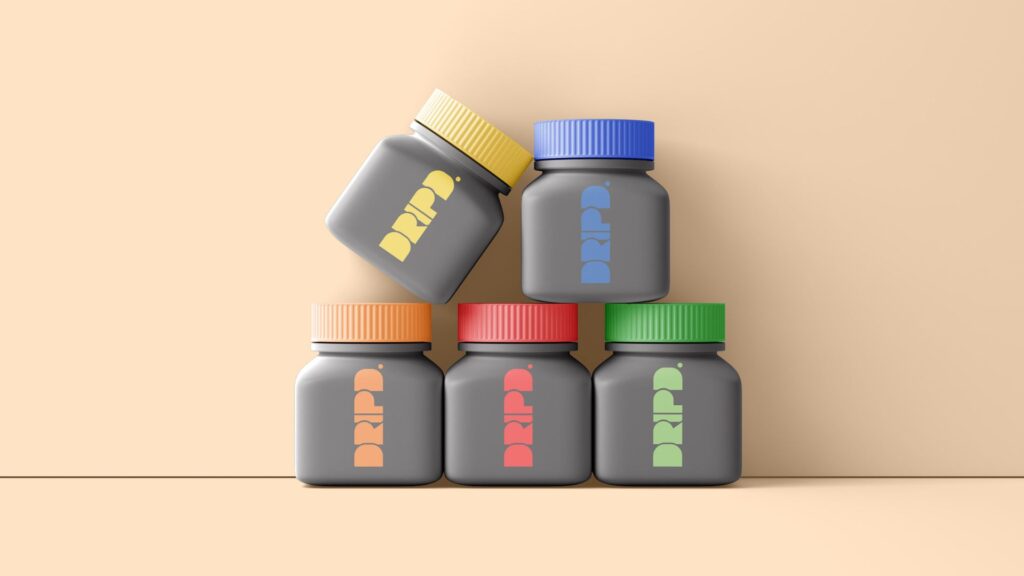
Embracing Finland’s strong environmental ethos, Dripd Paints is committed to sustainability. The packaging design reflects this, using recyclable materials and encouraging reuse. The company’s vision extends beyond the product to influence the industry towards eco-friendlier practices.

clients