Details
Clients
Location
Involvement

Quiksip. A Refreshing Burst of Creativity

The Quiksip project began as a canvas of endless possibilities, aiming to encapsulate the vibrant essence of the brand’s flavors in its visual identity. The design process was meticulous, starting with a deep dive into the brand’s core values and the tastes they wanted to represent. Sketching and digital illustration merged, creating bespoke imagery for each flavor that would resonate with the target audience.

Quiksip is a bold foray into the beverage market, presenting a line of refreshing drinks with a visually striking packaging design. The brand embodies a vibrant fusion of flavor and art, designed to captivate and entice the modern consumer.

Each design iteration for Quiksip was a careful balance between aesthetic appeal and market functionality. Typography was chosen for its modernity and readability, ensuring the brand’s message was clear at a glance. The color choices were deliberate, not only to differentiate the flavors but to evoke the emotions and experiences associated with each taste profile. The design process was iterative, with continuous feedback loops to refine the visual elements to perfection.

Attention to detail was paramount in the packaging design phase. The materials and finish for the cans were selected to complement the graphics, ensuring that the tactile experience matched the visual intrigue. The goal was to create a sensory experience that started the moment a consumer laid eyes on the can and continued through to the last sip.

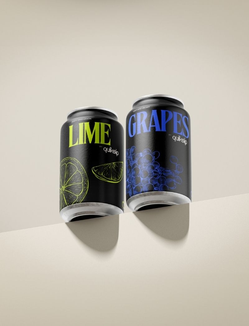
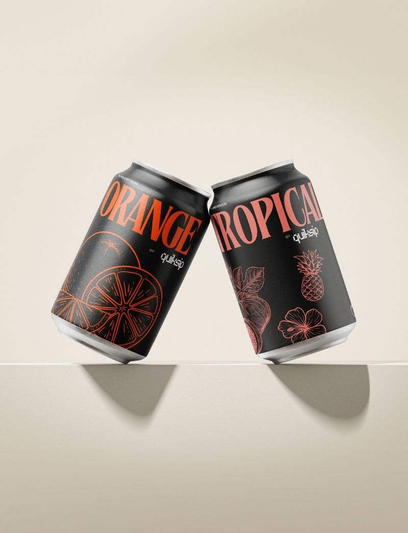
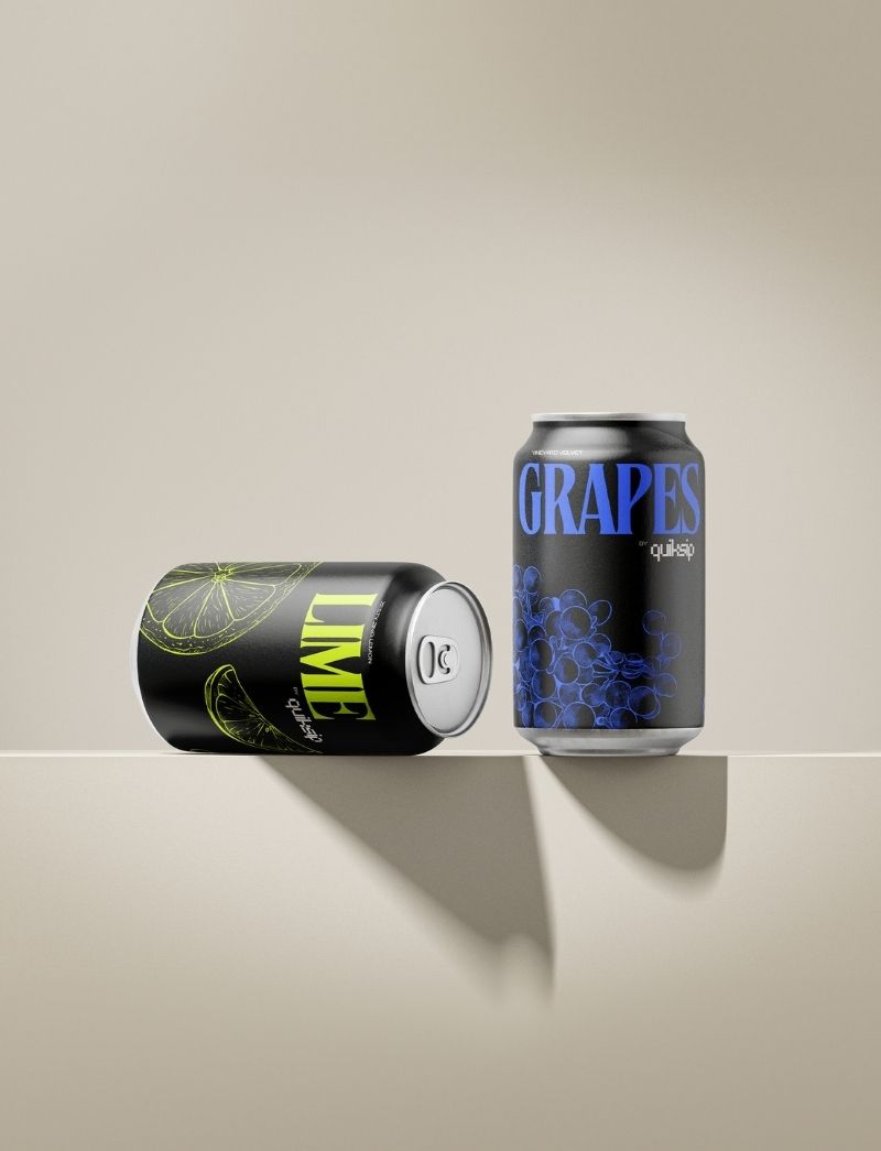
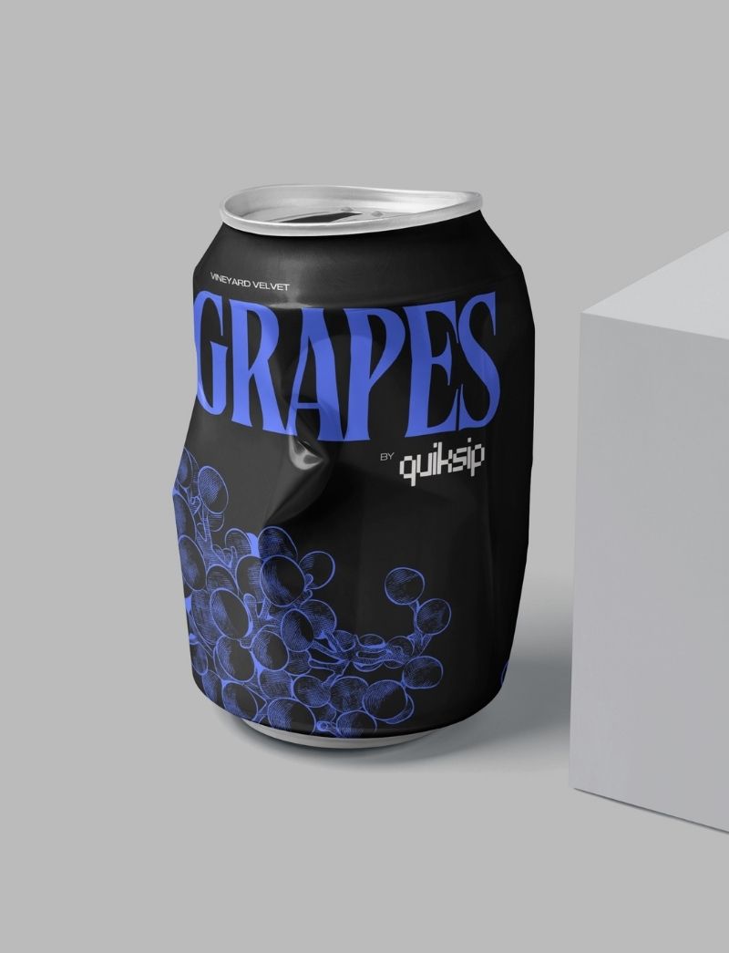
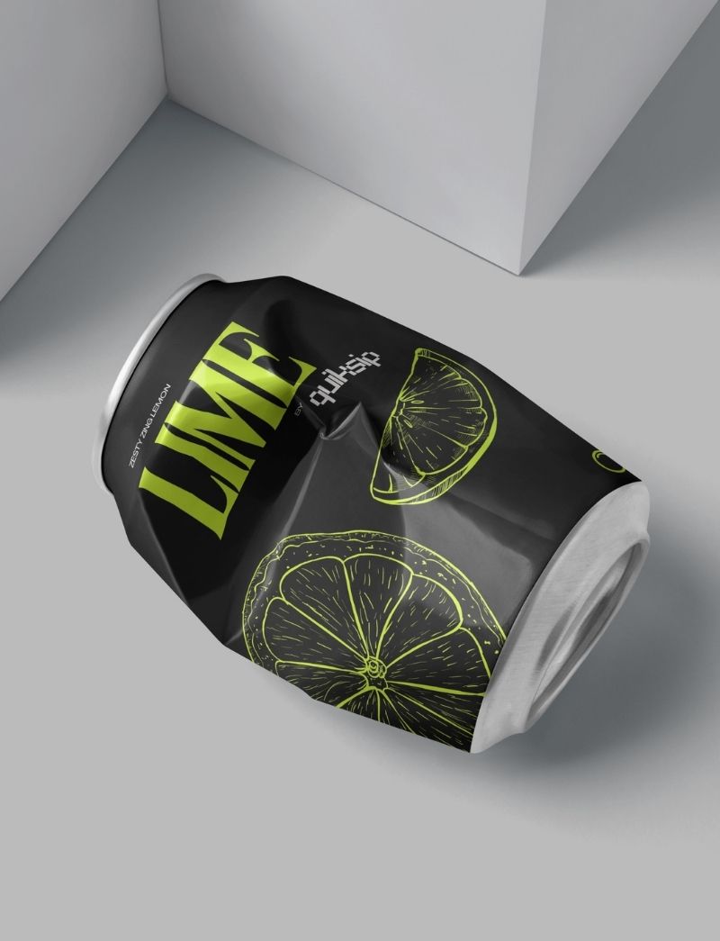
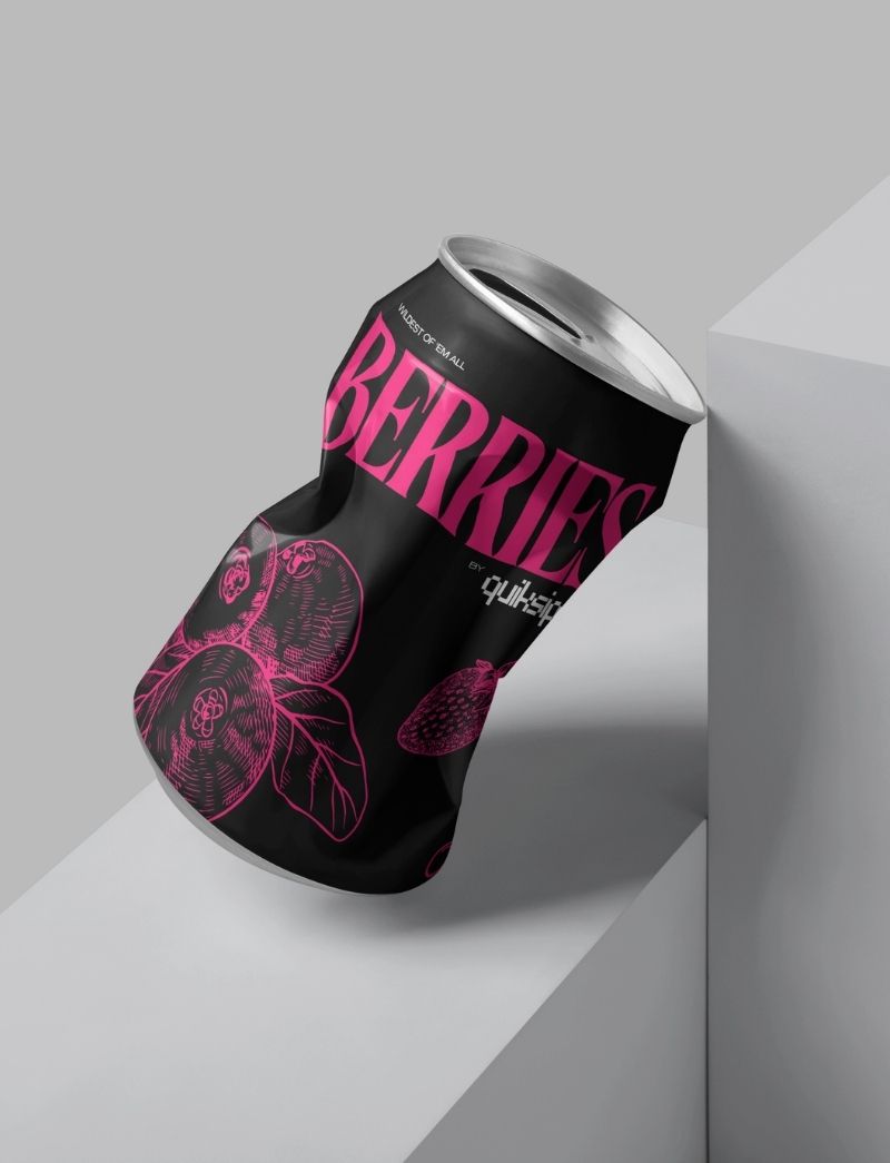
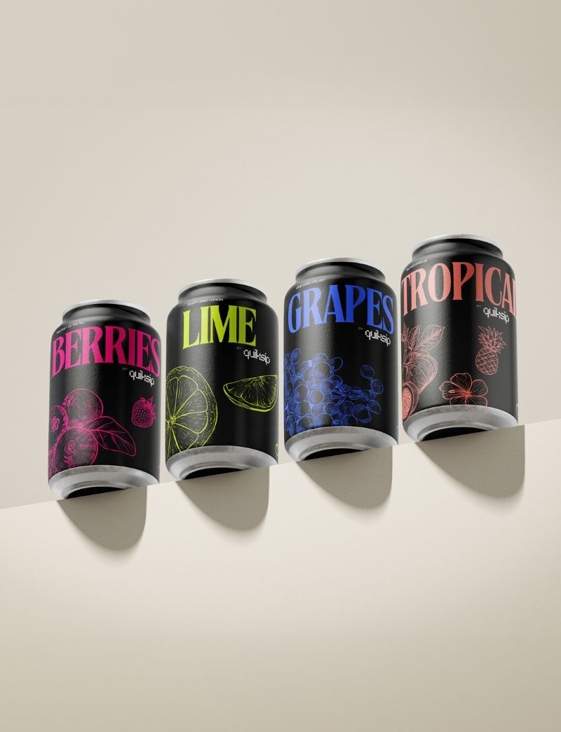
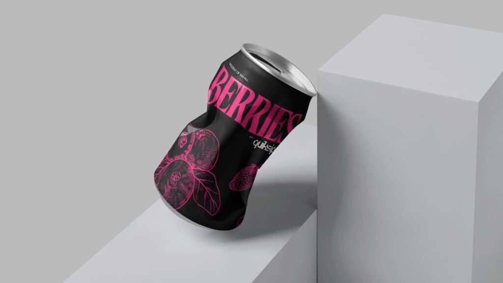
Sustainability played a crucial role in the design process, with eco-friendly packaging options explored to align with the brand’s commitment to the environment. The final product was not just a testament to great taste and design but also to the brand’s responsibility towards a greener future. The Quiksip packaging stands as a beacon of innovative design that speaks to both quality and sustainability.


clients