Details
Clients
Location
Involvement

Resaca Tequila, Elegance in Every Sip

Resaca Tequila represents the pinnacle of elegance, capturing the spirit of Mexico in a bottle. This project was an exploration in creating a brand that exudes sophistication from branding to packaging. Every detail of Resaca is curated to enhance the experience of the connoisseur.

The Resaca logo design is a homage to its Mexican roots, with sleek typography that whispers the traditions of tequila-making. The intertwining agave symbol reflects the brand’s commitment to 100% agave purity, marrying heritage with contemporary design.

The packaging of Resaca is not merely a container but a statement of premium quality. The clear glass elegantly showcases the tequila’s clarity, while the wood cork top serves as a nod to the natural aging process. The label design is minimalist yet striking, ensuring Resaca stands out on any shelf.

The aesthetic appeal of Resaca is intentional, capturing the essence of a smooth, sippable tequila. The color palette remains subdued, letting the tequila’s natural color speak for itself, punctuated by subtle details that allude to the sophisticated flavors within.

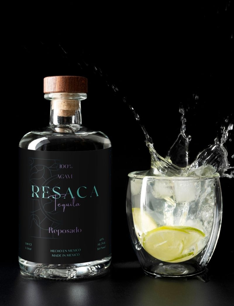
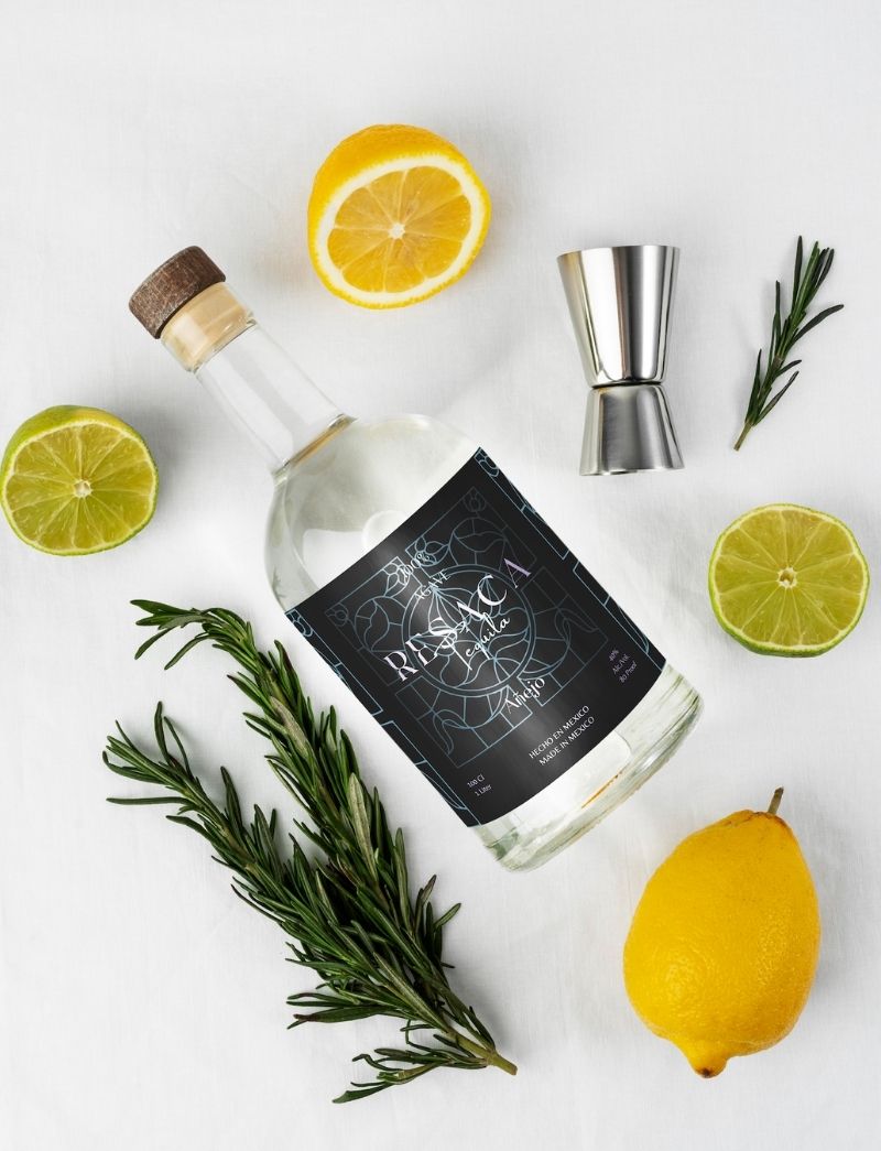
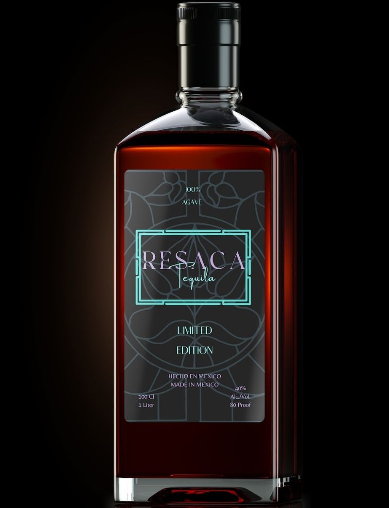
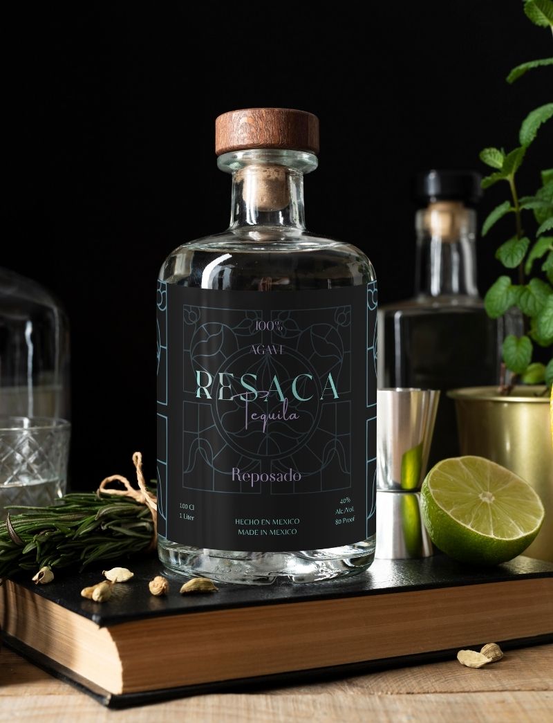
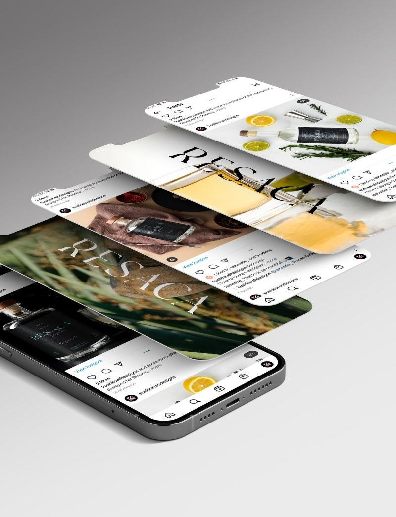
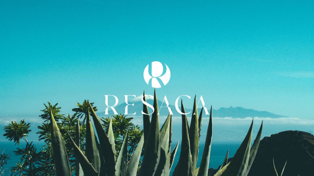
Designing for Resaca was about crafting an experience. Each visual element is a touchpoint that invites the consumer into a story of quality and craftsmanship. The result is a brand that not only looks exquisite but also tells the rich tale of its origin with every detail.

clients